Hypermedia Online Publishing: the Transformation of the Scholarly Journal
7.3.1 Basic demographics
Industry Sector results
This question asked respondents to indicate the industry sector for their employing institution. They were asked to choose one category and mark it with a cross. For students, it was assumed that their 'employing institution' was the one where they were studying. No-one indicated confusion with this interpretation. Table 7-51 shows the responses ordered alphabetically for each of the separate surveys and sub-surveys.
The Blanks columns is for those who did not answer the question. The Combined column shows those respondents who chose more than one option under Industry Sector (the survey instrument asked for primary industry sector only). These were a very small percentage.The Others column allowed respondents to write in a sector different to the choices given. The APA respondents were on average twice as likely to take this option.
Because some of the cells in the expected frequencies table (not shown) contain less than 5 expected responses no statistics can be calculated for the independence of survey group/subgroup and industry category. It can however be observed that the majority of the APA subgroup (some 70%) work in the Consultant or Education sectors. More than half of the APS subgroup work as Consultants. More than two thirds of the BPS respondents and the email respondents identified their 'industry' as being Education. The survey instrument did not ask for a breakdown by education sector, but it seems reasonable to assume the majority are from the tertiary sector. The email addresses for the email group certainly reflect this interpretation.
Employment Role results
This question asked respondents to indicate their primary employment role. They were asked to choose one category and mark it with a cross. Table 7-6 shows the responses ordered alphabetically.
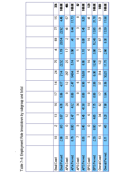
Once again, the column labelled Combined is for those respondents who marked more than one category. As a noticeable number of those who marked more than one category in the email survey indicated that they felt they were unable to separate their teaching from their research, a separate category of Teaching/Research was created. Respondents who selected both the Teaching and Research categories in the email survey were recoded into this category. This category was then added to the print survey to avoid the need for recoding.
Because some of the cells in the expected frequencies table (not shown) contain less than 5 expected responses no statistics can be calculated for the independence of survey group/subgroup and employee role. However, the breakdowns of answers within the subgroups are very different and need to be considered separately.
Table 7-7 shows the contingency table for Industry Sector against Employee Role for the APA subgroup. Within this subgroup, the predominant category is clinical practitioner (55% of all responses). Of these clinical practitioners, over half work as consultants. The education sector is responsible for over half the research employees, and almost all the teaching or teaching/research employees (not surprising perhaps). As one would expect, almost all the consultants list their industry sector as consultant as well.
Table 7-8 shows the same breakdown for the APS. Here the overall numbers are much smaller, but consultant is still the largest employment role.
Table 7-9 shows the contingency table for Industry Sector against Employee Role for the BPS subgroup. The APS respondents are much more evenly distributed by both employment role and industry sector.
1. In order to make it easier to read this table (and successive tables like it), a different shade has been used for the count and percent rows. In other words, the percent rows are always the same shade. As this table shows percentages, it is important to indicate clearly if these are row or column percentages. Three things indicate this: the totals are in bold, they are at the end of the row (i.e. row percentages), and the percent totals always add up to 100.
Last modified: Monday, 11-Dec-2017 14:41:34 AEDT
© Andrew Treloar, 2001. * http://andrew.treloar.net/ * andrew.treloar@gmail.com